My Home Screen - March 2025
I like to check in on my home screen periodically and see how things evolve. This is my third post containing a home screen, you can see past versions under the homescreen tag.
Main Home Screen
This is my daytime home screen. There are a few changes from last time.
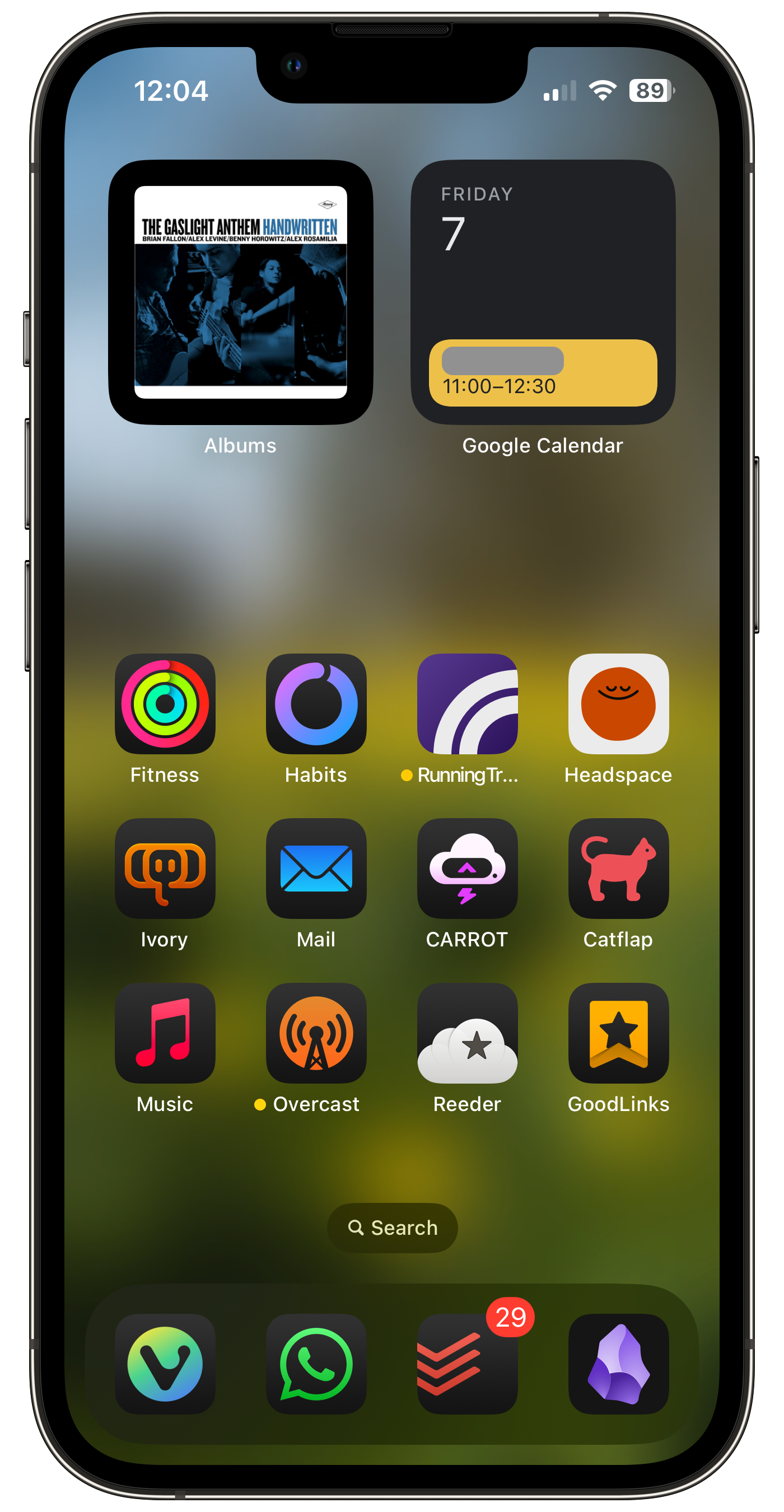
Dock
Mostly my Dock is the same:
- Web browser,
- WhatsApp (the only messaging app that people I talk to actually use, sadly),
- Todoist,
- Obsidian.
But I've got a new browser. I replaced Safari with Vivaldi. There are a few reasons, which I won't go too deeply into (I have another post in the works for that rabbit hole), but to sum it up, I'm trying to avoid giving money or data to big US companies, where I can. And Vivaldi is pretty good, so I've switched over to using it as my browser on all devices.
Widget Changes
- I've removed the Carrot Weather widget, as I found I didn't actually use it much. I would usually go into the app to look at more data, so I've just replaced the widget with the app icon.
- In place of Carrot, I've moved the Albums widget up, as I still love seeing my favourite album covers decorating my home screen. And the top of the screen is harder to reach, so is better for less interactive widgets.
- I've put the calendar widget up there too, although I've stopped paying the large amount of money for Fantastical and moved over to Google Calendar, which is fine as apps go. (I'd prefer to move my calendar to a service and company based in the UK or Europe, but it's a shared family calendar so it's harder to make that switch. Similar problem to WhatsApp, services that involve others are harder to change.)
App Changes
In removing the Carrot widget, I've got a lot more space for apps, so I added another row, then kept one more row free, to avoid visual overload. Notable changes that I've made in the app icons I keep around:
- Music.app replaces Spotify. I'm using a local library, not streaming. I want to avoid giving Apple or Spotify money if I can help it. (I know Spotify is a Swedish company, but they also pay a lot of money to unsavoury podcast hosts.)
- Reeder is still there, but it's actually something I've recently come back to. I used NetNewsWire for a while, but when I set up FreshRSS for hosting, I switched back to Reeder (Classic, as it is now) because the UI is just nicer to me. I don't know how long Reeder Classic will stick around, but it works best for me for now.
- I've put Ivory on my home screen. I have used it for as long as it's been around, but I keep going through cycles of trying to cut back on social media and trying to be more social.
- I have a shortcut to access the Sure Petcare app, because the app icon, in spite of having a white background, doesn't convert to a dark mode icon.
- I've removed the Kindle app. As I've mentioned before, I want to give less money (and data) to US companies. I'm not a heavy reader, and the BorrowBox app for my local library works well enough for my liking. I'm also trying to read more physical books.
- I've also removed Slack from my home screen, as I only use it for work and don't need or want to see it constantly.
Fitness Apps
The extra row of apps on my home screen is dedicated to fitness.
- Apple Fitness is the hub of things. It's how I view my tracked activity from my Apple Watch. I don't really need quick access to it, but it brings it up to a 4th row of fitness apps.
- Awesome Habits is a habit tracker that I use to try to build better habits, like drinking less coffee, eating more fruit and veg, writing in my journal, etc. I've had it for a few years now and keep going back and forward between using the widget (see night mode) and the app icon. (Strictly speaking it's not a fitness app, but I use it mostly to manage my fitness habits.)
- Running Track is my app that I use to analyse my running data and I will definitely probably release to the public at some point some day.
- I really like Headspace's guided meditations. I find they help me to be more present and more relaxed.
- I don't use Fitbod any more, as I didn't have the time for the workouts, so didn't want to renew the subscription. It's still a great app, which I expect to come back to some day.
Night Focus Home Screen
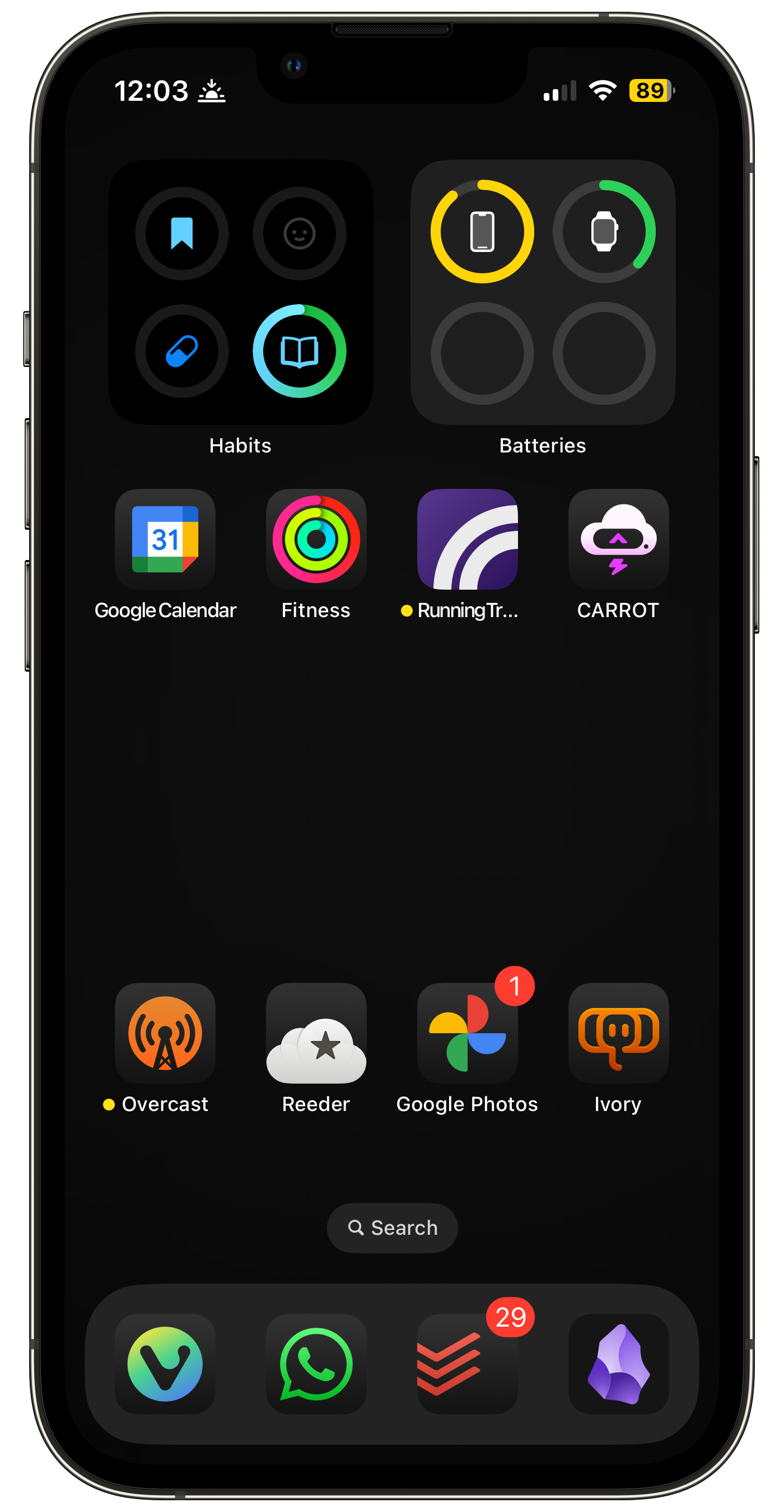
My aim with my evening home screen is to try to make my phone calming, and less distracting. I want to use it less in the evenings, and do things like read or watch TV to wind down. When I do use my phone, I want to make it look less bright and vibrant. I love the new dark app icons and tinted icons for this.
- There are some apps I use a lot in the evenings, and having quick access to them is useful. Those are the ones I've kept around.
- Beyond that, I've tried to go to an all-black screen, to remove as much visual stimulation as I can. And anything I wasn't frequently using in the evenings, I've removed.
- Later in the night, between 10pm and 6am, I've got the app icons and widgets tinted red, to make it even less interesting to look at, and to make sure my interactions with my phone are as intentional as they can be.
- I've kept Running Track here to remind myself that I need to make a dark mode icon for it! It stands out here, in a bad way, and having the visual reminder there will nudge me to actually fix it.
- At some point I've swapped the Awesome Habits and Batteries widgets around, I don't remember why!
- I've stopped using Duolingo, as I felt like I hit my limit of learning French without actually using it in conversation. I do miss seeing the widget go completely unhinged when I reached the end of the day and hadn't completed a lesson.
- I've also stopped using the Todoist widget, because, much like Carrot Weather, I found I mostly wanted to go into the app, and the preview of a list wasn't particularly useful to me.
Watch Faces
Daytime
I try to keep my watch faces as useful as possible. I don't use it for a huge amount of stuff, so anything I do use it for should be accessible from the watch face rather than tapping into the app grid, where possible.
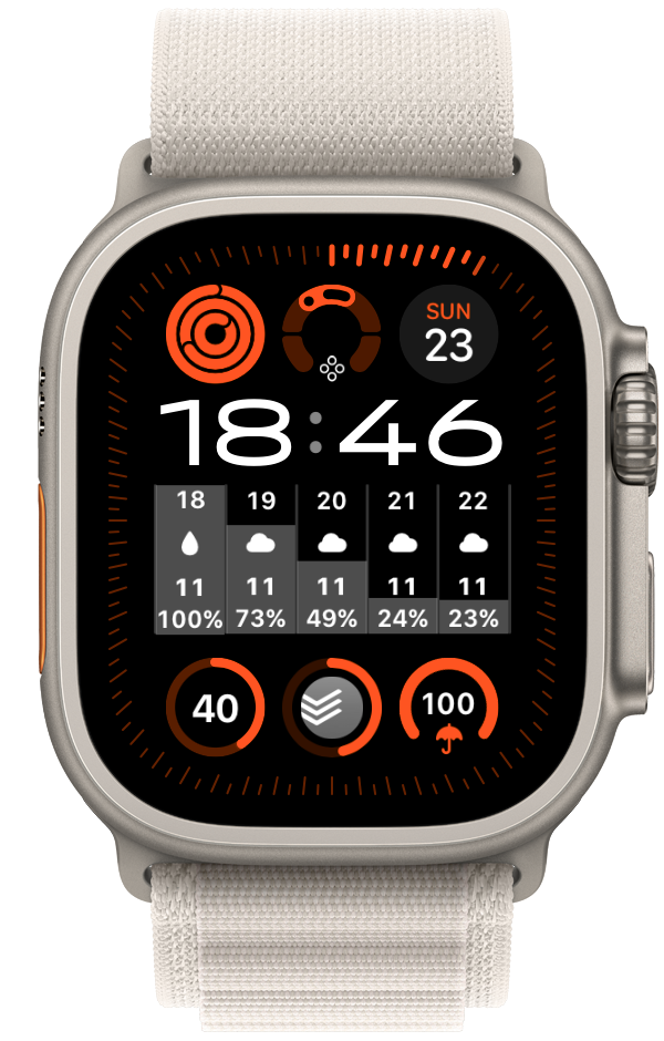
- The main complications here are Activity, Vitals (to help me understand how badly I slept last night...), a glanceable date, the tall Carrot 5-hour forecast, Awesome Habits, Todoist, and to fill out the last slot, Carrot's rain prediction.
- The two other uses I have for my watch are tracking runs, which I start from the action button on the left of my Apple Watch Ultra, and controlling music and podcasts, which happen from the app auto-launching when I start playing something on my phone.
Night
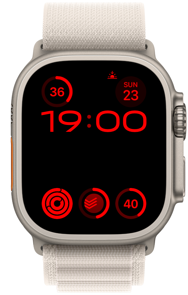
I have the same approach to night mode on my watch as on my phone.
- I want as little content as possible, while still being useful, and as dark as possible. So it's set to night mode, making everything red (therefore dark).
- I remove the Carrot and Vitals complications, and add the Watch's battery percentage so that I can see if I need to charge before bed.
Published on 7 March 2025