Making SwiftUI Buttons with Equal Widths
I've been writing some SwiftUI recently for my run tracking app and I hit a really annoying problem.
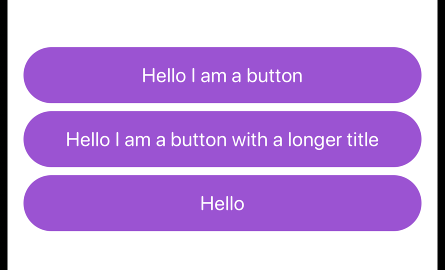
It's really common to have two buttons, one above another, and to have those buttons be the same size. However, when I tried to do this by laying out Buttons in a VStack, they wrapped to the smallest width needed to fit the labels. That meant that every button was a different width.
I wasn't especially surprised about this. It makes sense for the default behaviour to be for the Button s to take up as much space as they need and no more. But I knew my use case was pretty common, so I went looking for ways in which I could make it work. And there are a few, it turns out. It's a common use case, but not one especially well-supported in SwiftUI...
My first ports of call were the articles on exactly this subject on Swift by Sundell and Hacking with Swift. I trust these two sources to have good solutions, and I usually find they have something that works cleanly.
Then I saw that there are all sorts of solutions to this, including using GeometryReader and even PreferenceKey! Seems a bit messy. But I knew one of the solutions would work, right?
Nope.
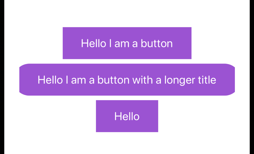
I tried every option and got no further forward. My Buttons were even clipping in some cases so that they lost their rounded edges. Clearly SwiftUI was trying to do something, because it seemed like the Buttons were being sized up then cut back down to their original sizes, losing the rounded edges in the process. But it wasn't doing what the articles suggested.
So I went back to Google. And I found this article by Sarun Wongpatcharapakorn. In it I found something interesting:
[W]e need to apply
.frame(maxWidth: .infinity)before we apply a button style.
I'd been using that approach, setting the frame on the Button as described in the quote, then setting .fixedSize(horizontal: false, vertical: true) on the containing VStack. So this seemed relevant to my problem.
But when does the button style get applied? I wasn't explicitly applying a style, but as someone fairly new to SwiftUI I assumed that it wouldn't matter in which order I applied modifiers to my views. Turns out that was naive! And I don't understand the logic of my solution either.
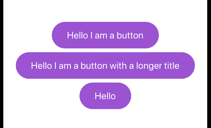
Here's my first Button code, which clips the images:
struct PurpleButton: View {
    let buttonTitle: String
    let action: () -> Void

    var body: some View {
        Button(buttonTitle, action: action)
            .font(.system(.title3, design: .rounded))
            .padding(EdgeInsets(top: 16, leading: 32, bottom: 16, trailing: 32))
            .foregroundColor(.white)
            .background(.purple)
            .frame(maxWidth: .infinity)
            .clipShape(Capsule())
    }
}

// Preview, where I generate the images in the screenshots throughout the article.
// The `fixedSize` modifier is used in here for an example.
struct PurpleButton_Previews: PreviewProvider {
    static var previews: some View {
        VStack {
            PurpleButton(buttonTitle: "Hello I am a button", action: {})
            PurpleButton(buttonTitle: "Hello I am a button with a longer title", action: {})
            PurpleButton(buttonTitle: "Hello", action: {})
        }
        .padding()
        .fixedSize(horizontal: false, vertical: true)
    }
}
And here's the fixed Button: I moved the frame(maxWidth: infinity) modifier before the .background modifier gets applied.
struct PurpleButton: View {
    var body: some View {
        Button(buttonTitle, action: action)
            .font(.system(.title3, design: .rounded))
            .padding(EdgeInsets(top: 16, leading: 32, bottom: 16, trailing: 32))
            .foregroundColor(.white)
            .frame(maxWidth: .infinity)
            .background(.purple)
            .clipShape(Capsule())
    }
}
That generated what I wanted! But why?
That's still after the font and foregroundColor are applied, so which styling modifiers count towards "applying a button style"?
In the final version of the code, at the bottom of this article, I've moved the frame and padding to be set first, then the colour and style modifiers afterward, to group things more logically.
I've written this up so that I have a solution when I come to do this again, and hopefully to help anyone else who hits this same problem. But also in the hope that I can follow this up with a better explanation of why this happened! If you understand what I was doing wrong here, and why the order of the modifiers mattered in such a strange way (some styling modifiers got in the way of the layout system but others were fine?) then please let me know!
I am enjoying using SwiftUI a lot of the time, but when you hit things like this which just make no sense it really does make me question learning it.
Code Snippet
Here's the final working code for my custom Button, and a preview that shows it:
import SwiftUI

struct PurpleButton: View {
    let buttonTitle: String
    let action: () -> Void

    var body: some View {
        Button(buttonTitle, action: action)
            .frame(maxWidth: .infinity)
            .font(.system(.title3, design: .rounded))
            .padding(EdgeInsets(top: 16, leading: 32, bottom: 16, trailing: 32))
            .foregroundColor(.white)
            .background(.purple)
            .clipShape(Capsule())
    }
}

struct PurpleButton_Previews: PreviewProvider {
    static var previews: some View {
        VStack {
            PurpleButton(buttonTitle: "Hello I am a button", action: {})
            PurpleButton(buttonTitle: "Hello I am a button with a longer title", action: {})
            PurpleButton(buttonTitle: "Hello", action: {})
        }
        .padding()
        .fixedSize(horizontal: false, vertical: true)
    }
}
Update
Sean Heber explained to me on Mastodon what’s happening here. His thread explains it really well, so I won’t try to paraphrase it, other than to say that the order of modifiers matters because they don’t actually modify the Views, they create new ones…
Here’s the link to his thread. Thanks Sean!
Published on 1 November 2022